What are the Ten Best Car Logos of All Time and where do they come from?
Logos are everywhere we go. Even at home you see them on many things surrounding you. For example, everything in your pantry will have a logo on its package, and it’s the same for all your electronic equipment. Even when you open the TV set, you’ll have the logo of the station you are watching, and of course, the logos of the brands advertising on that channel. Car logos are particular, as we cross them everywhere on the street. Here are the ten best ones and their origin.
Audi
One of the most popular car brands logos as to be this one. When Audi was launched, its logo was a single circle. When it merged with three other companies, it added three more rounds, which is the way we all know the Audio logo today.
Cadillac
How many American songs talk about this car brand? Too many to try to figure it out in this article. The Cadillac logo is actually historical, as it is similar to the coat of arms of explorer Le Sieur Antoine De La Mothe Cadillac, Founder of the city of Detroit (the main car manufacturer city in America for a long time).
Ford
This classic American brand has been stable for more than a century now (1912). Its signature is recognized around the world, even if it was modified a little through time. Its blue colour has remained unchanged throughout the years.
Porsche
The Porsche logo is a classic. It is the union of two coats of arms, with one representing the Free People’s state of Wurttemberg, from former Weimar Germany.
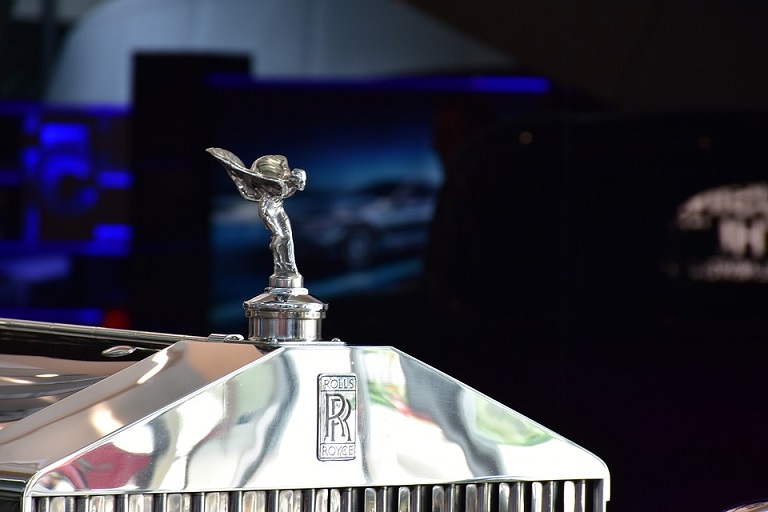
Rolls-Royce
When you see the double “R” logo, you know you are in for a high level of luxury and excellence. This minimalistic logo hasn’t changed through the year, except for the fact that the size of the two “Rs” became most prominent as years went on.
Jaguar
The Jaguar logo has changed through time. From some kind of pair of wings in 1922, it finally settled on the shape of a Jaguar, after 1945. The contour of the wild cat remains identical, but its shape has seen changes as well.
Ferrari
When one thinks of Ferrari, the horse (and the colour red) naturally comes to mind. However, that is not the original logo. It came later, from a symbol painted on the side of a plane, belonging to Count Francesco Baracca, a famous pilot in the Italian Air Force during World War I.
Maserati
Maserati’s trident logo has never changed through time. It comes from the Fountain of Neptune which can be found in Bologna’s Piazza Maggiore.
Chevrolet
Chevrolet’s logo is simple. It represents a bowtie. History says the co-founder chose it, while in a hotel in Paris, but his wife said it came from a Virginia newspaper add, from 1912.
Bentley
The “B” encased in wings is known to all as a synonym of total luxury. Why make it complicated when luxury can be so simple…

